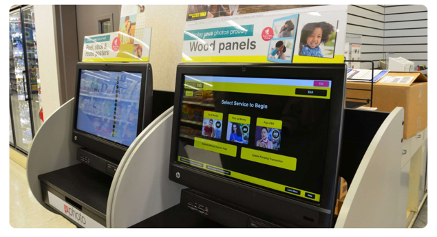
Western Union Self-service Kiosk
Western Union Application
Brief
Provide convenience to retail customers and help the company save operational cost.
Overview
In the US, the Western Union kiosk produces roughly 15,000 monthly transactions which generated around $5 million in revenue at retail stores. The company sees big potentials around the self-service products.
About the project
Background: I worked with two project managers as well as a content strategist and three teams of engineers (across France, San Francisco, and Denver Offices) along with the Design System team to ship this product.
Role: Product Designer, User Researcher, Visual Designer.
Duration: 6 months
Challenge
Learn WU customer's preference and user behaviors, define environmental and technical limitations, and figure out ways to efficiently utilize screen space by eliminating unnecessary content.

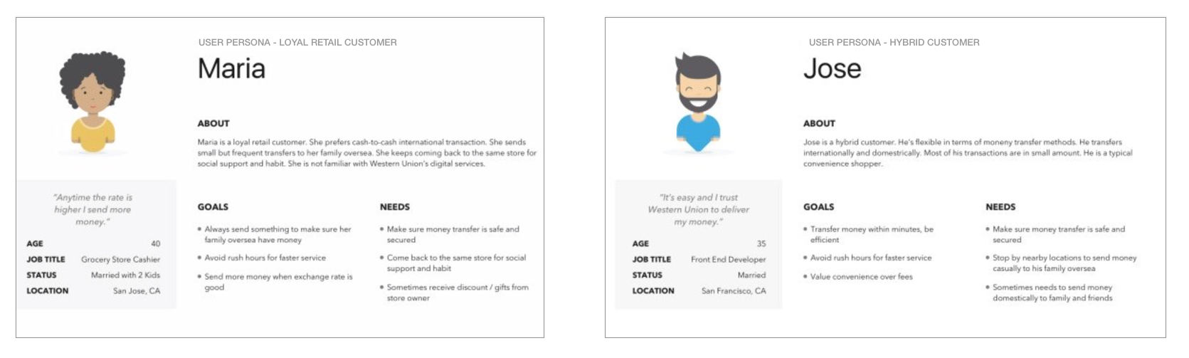
Persona
According to existing research data, there are three types of customers across the service ecosystem that the product will be targeting to 1) loyal retail customer, 2) hybrid customer, 3) new/potential customer.
Talking to customers
In order to understand the target audience a bit more, I conducted user interviews at Western Union's retail locations. By doing this, I could capture why customers use Western Union kiosk and what value they took from it.
I learned that customers use our product to reduce the amount of time they have to wait in line. I also discovered concerns customers have with the current product.
Customer concerns
Several major concerns were discovered from the user research.

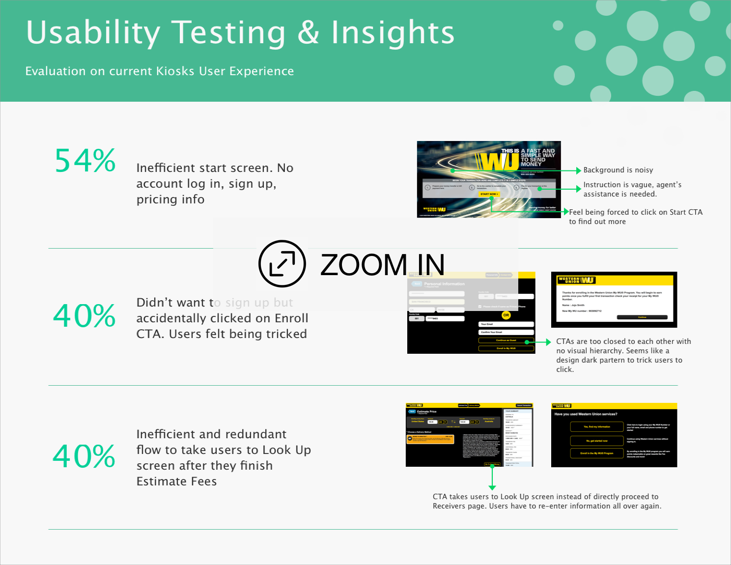
Testing with current product
To learn the details about the pain points customers have with the existing product, I conducted online usability tests.
I found out that the average transaction time is 6 minutes for existing customers and 10 minutes for first-time users.
According to the data, the average transaction time with a retail agent is 15 minutes. This means using kiosk doesn't have a big improvement on the job efficiency.

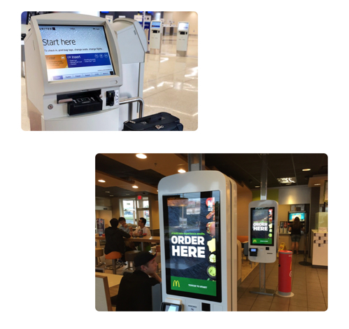
Competitor research
I also looked at other similar products (such as airline kiosks, Coinstar, McDonald's) to further my research on what a useful kiosk product is comprised of. Some takeaways of what made them successful included:
- Well structured navigation
- Simplicity with no unnecessary steps and information
- Clear affordance
- Make text and elements visible with sufficient contrast
Design goals
Based on all of the findings shown above, I worked with my project manager to define the objectives: to minimize user friction and maximize transaction speed. In order to achieve that, we decided to:
- Reduce the number of steps to complete the transaction
- Reduce cognitive load by simplifying the content
- Make navigation clear and easier

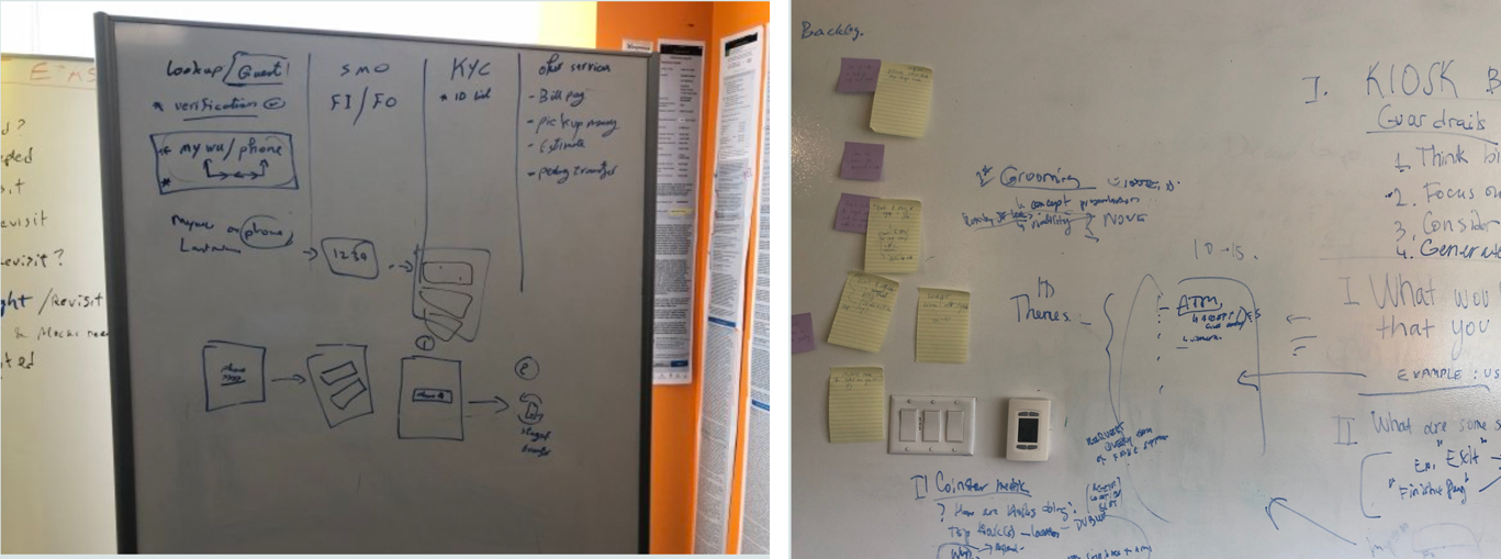
Brainstorming & Sketches
I ran a brainstorming session that was composed of members from the design and product teams to determine which features of the existing product should stay, be relocated or be eliminated based on the metrics we have for the existing product.
The conclusion is that the new kiosk product will be focusing on the send money flow which is the core of the business and gets the most traffic.
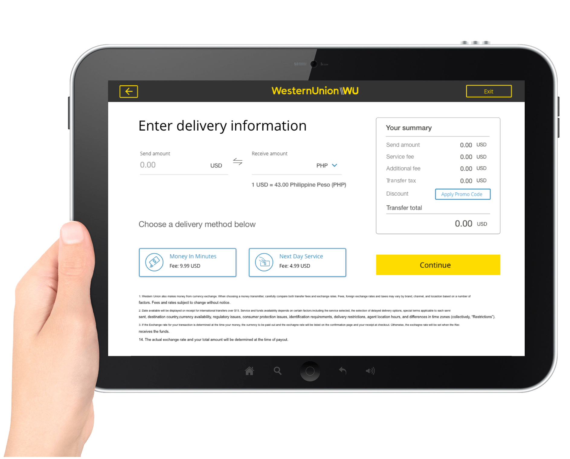
And it must include the following key features in order to provide a complete and comprehensive user experience:
Select Service | Lookup Screen | Recipient's Information | Price Estimate | Review & Confirm | Payment and Print
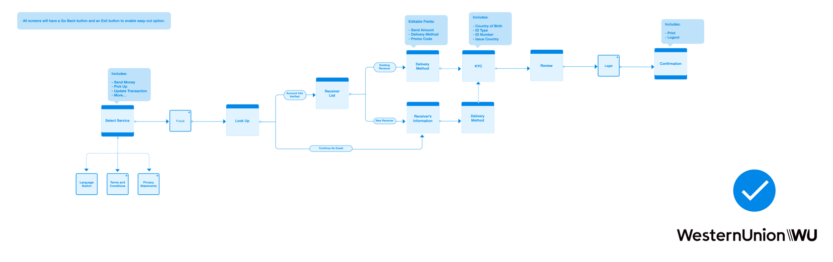
User Flow (Holistic Approach)
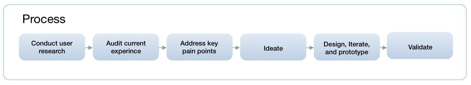
In order to improve the user experience holistically, I created a user flow chart for kiosk experience.
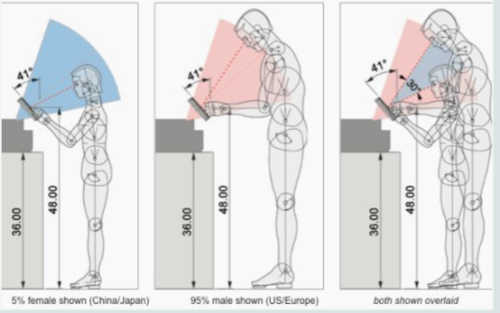
Environment & Ergonomics Evaluation
As for the ergonomics aspect, there are four important dimensions that have the direct impact on the interaction between user and kiosk machine.
They are the screen height, keyboard height, cash slot height (if applicable), and cash slot height (if applicable). Although the team has no control of Coinstar kiosk machine, the knowledge is good to know and keep in minds for.

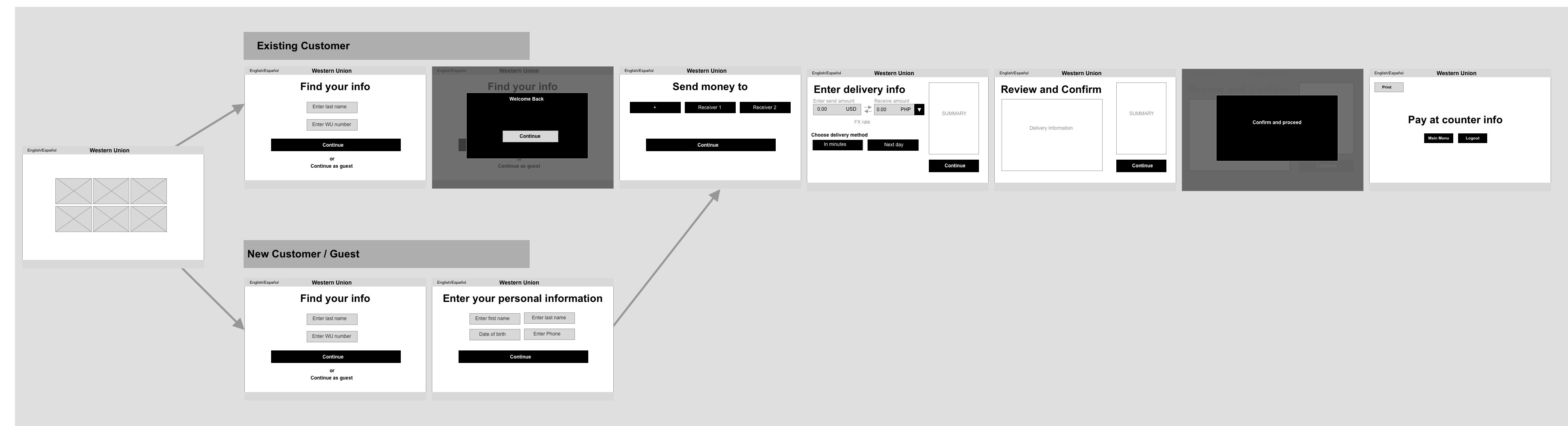
Low-fi Mockups
Based on the research findings and team brainstorming results, wireframes are created for stakeholders to review to gather further feedback which gives flexibility for the team to iterate on the design at the early stage and avoid any wastes during the development process. The interactive prototype is also created using the wireframes to test the flow at the early stage to validate the experience design..
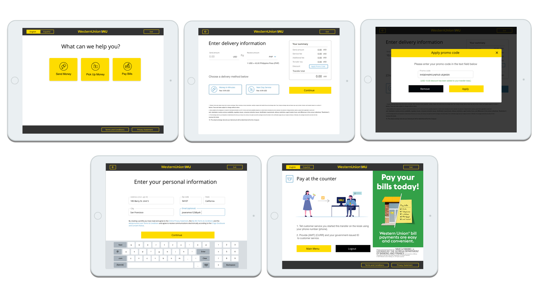
High-fidelity screen mockups
Since the style of the kiosk machine has already been established in the Design System, the team moved forward with hi-fi mockups once the screen wireframes got approved by product and legal team.
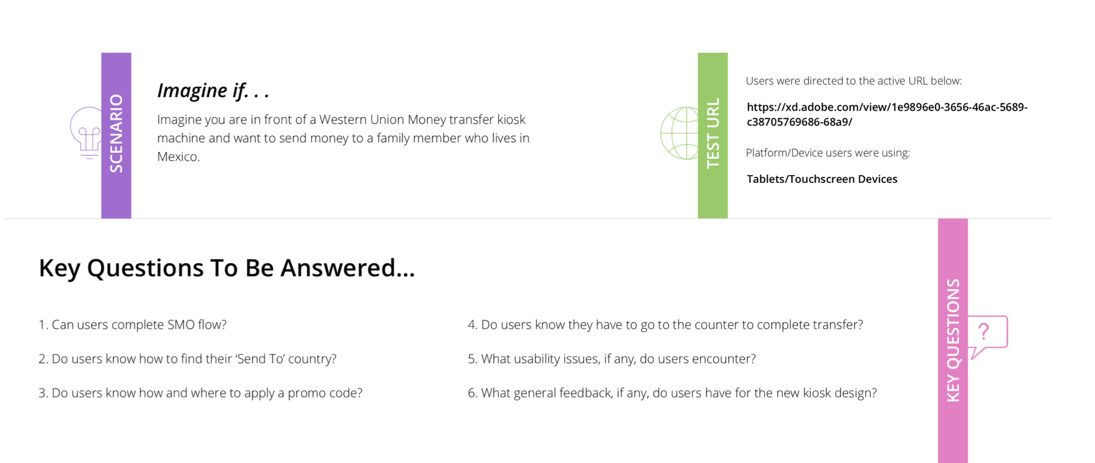
Test with prototype
During the course of the production, I've conducted three rounds of usability testings using the iterated interactive prototype.
Check out the interactive prototype
Testings and Validation
Usability testing is involved in every key stage of the development process to help the team looking for design flaws and pain points to reduce user friction and improve the experience of the product. The primary tool we use is field research and interview, as well as online testing which allows us to get direct feedback from users in a timely manner.

Impact
The product launch plan consists of two phases.
- Phase 1 is to launch the pilot to 10% of the vendor locations to test the market.
- Phase 2 is to launch the product nationwide in France.
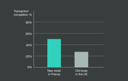
When comparing the early-stage conversion metrics between the US kiosk product and the newly-designed French version, we noticed a 23% difference in the transaction completion rate.
Additionally, among the users who completed the transaction steps and reached the review page, the drop-off rate has decreased from 35% to 14%.
Challenges and learnings
One of our main challenges is the lack of resources and time that we have. With this challenge, we often have to reiterate our designs in order to be achievable within time and technical constraints, while still providing more value to our users.
On the other hand, the hardware machine that the product will be running on was not available for us. That caused the team had to run QA testings on a simulator rather than on the real device. We encountered bugs that cannot be captured in the simulator. That caused the delay in the production.