WU Mobile App Onboarding
Welcome Experience
Overview
Throughout 2018, Western Union has been working on improving customer experience and attracting new customers. As a continuation of the efforts, the team proposed to inject a welcome experience (not existed before) to Western Union's mobile app. The goal is to present the value proposition and get people engaged to use the product.
About the project
Background: I worked with a project manager as well as a content strategist and three mobile engineers to ship this product.
My Role: Product Designer, User Researcher
Duration: 6 sprints

Why onboarding experience is so important?
The welcome experience is the first step of onboarding customers. It gives an opportunity to convey the value proposition and attract people's attention in order to convert them into loyal fans who will pay for the service.

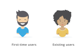
Target audience
Our primary users are new customers who we would like to present the instant value of the product and get them engaged. Our secondary users are existing customers who we want to emphasize the product value to and help them realize more values of the product.
User research
I then conducted interviews with 10 customers (5 existing customers and 5 potential customers) to collect qualitative information about the overall app experience and to gauge whether customers had a need that might be met with a comprehensive onboarding experience.
User Interview Findings
Customers use Western Union app to:
Content Strategy
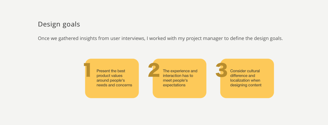
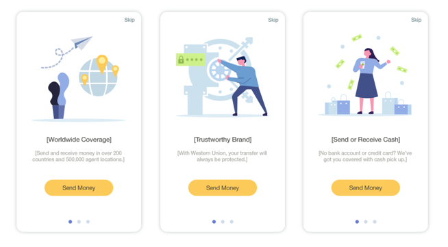
My content strategist and I decided to focus the content on the three aspects of the product value proposition.
Trustworthy Brand: For more than 150 years, we're still the reliable choice for moving your money.
Worldwide Coverage: Send and receive money in over 200 countries and territories and 500,000 agent locations.
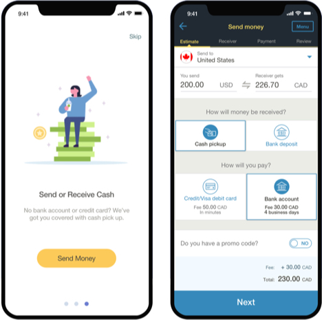
Send or Receive Cash: No bank account or credit card? We've got you covered with cash pick up.
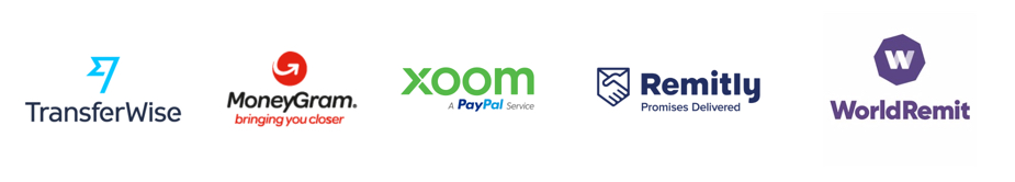
Competitive Analysis
Because the onboarding feature didn't exist before this project, there's no baseline for the team to use to compare with. Therefore, I started with conducting competitive analysis with five direct competitors (TransferWise, Xoom, MoneyGram, Remitly, and WorldRemit).
The takeaways can be summarized into the following categories:
- Welcome Experience: TransferWise, Remitly, and WorldRemit have comprehensive welcome experience when a user first launches the product.
- Signup Wall: TransferWise, WorldRemit, and Xoom require users to have an account before being able to initiate a money transfer.
- Social Media Login: TransferWise allows Apple ID and social media logins. Xoom allows users to use their PayPal account login.
- Registration Process: TransferWise, WorldRemit, Remitly, and MoneyGram have a simple process that requires 4 data inputs (country, state, email, and password). MoneyGram has a lengthy registration process.
- Other Onboarding Methods: TransferWise and Remitly use dashboard, notification widgets, and progress meter as additional onboarding methods to guide users throughout the process.

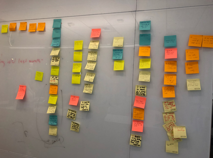
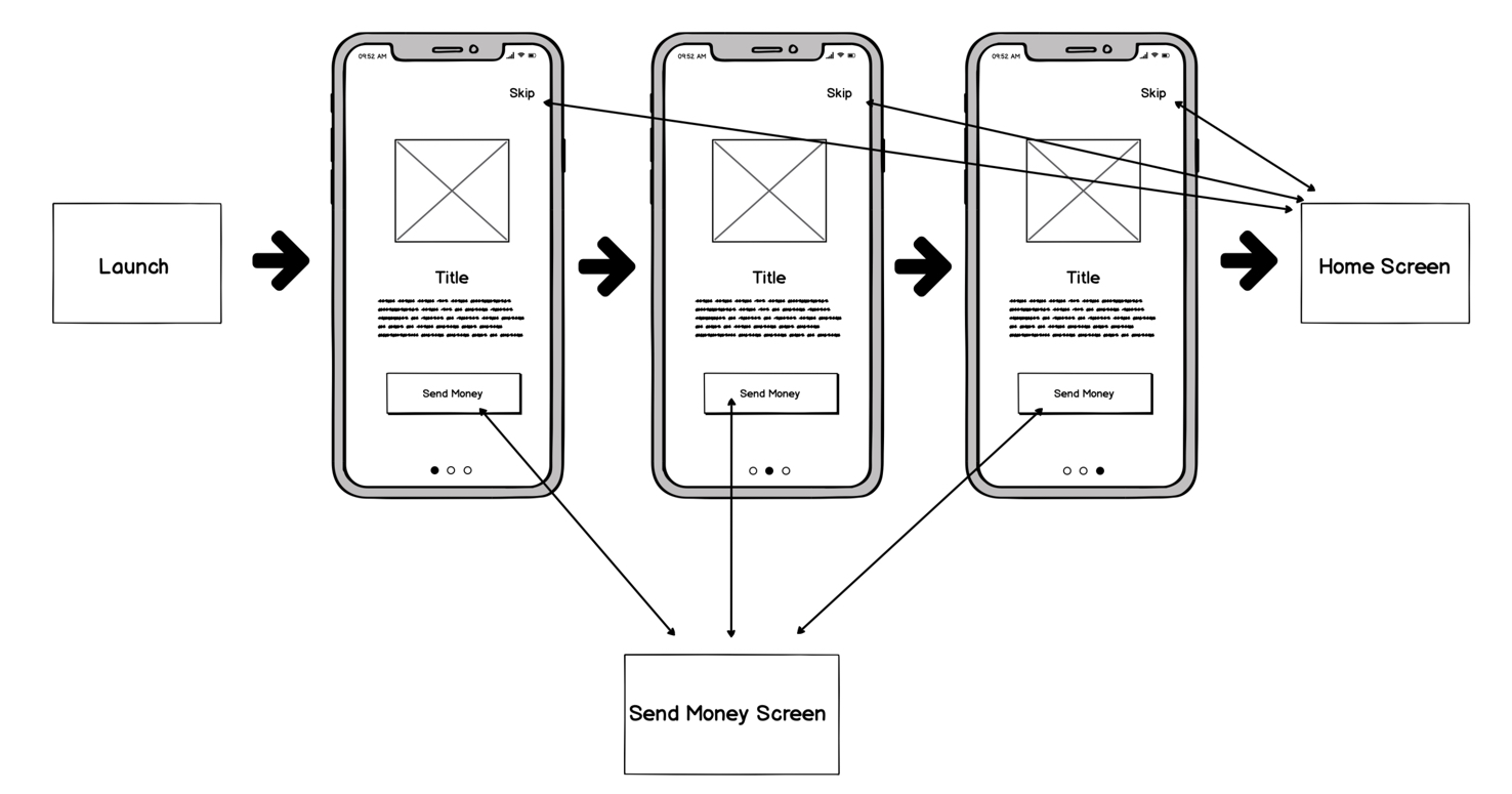
Ideation and UX flow
We came up with the UX flow under the assumption that people would either complete the onboarding experience or get redirected to other areas of the product.
First iteration
In my first iteration, I optimized for storytelling to evoke people's emotions.

Implementation and code integration
When it comes to implementation, we provided the template to the engineering team help build the onboarding screens.
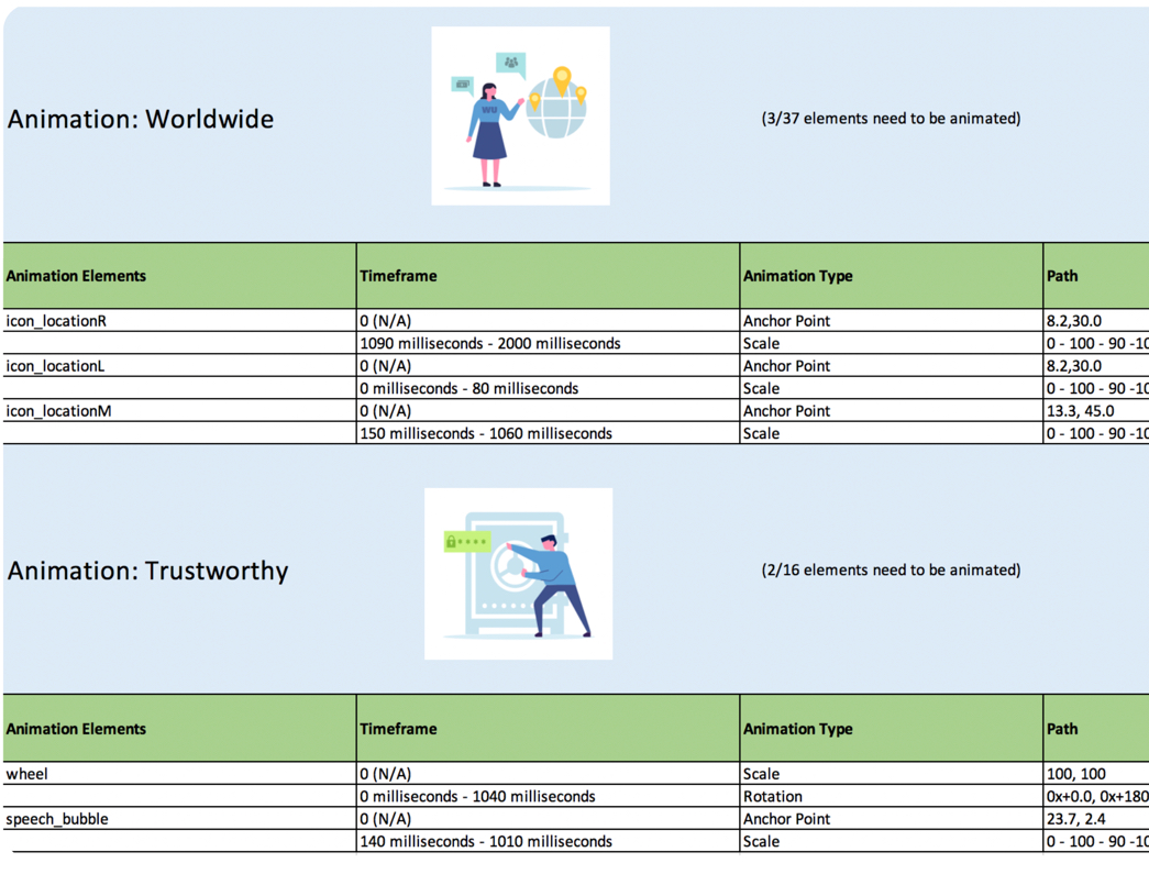
Animation integration
Animations were added to the finalized illustrations to help visualize the ideas we were trying to convey.
What I learned
The entire project (from initial pitch to final release) took about 6 months. That is because of the lengthy and complicated approval process of the company. The team experienced a lot of back and forths with the legal and compliance department in terms of content approval. The team also encountered technical difficulties with implementation. We originally planned to import the animation (in SVG format) directly into the code. However, the engineering team realized that the codebase is not compatible with SVG files during the process. That caused the delay of the production as engineering had to hardcode the animation at the end. Overall, it was great teamwork and collaboration. We received positive feedback and compliment from our users and stakeholders.