Western Union Website
Enhancement Project
Overview
Western Union is a financial company. Goal is to create an easy, fast, and reliable online money transfer experience to serve customers worldwide.

About the project
Background: I worked with cross-functional teams (product, content, engineering, and marketing teams) to develop new features and optimize the existing experience of the product.
Role: Product Designer, User Researcher.
Duration: Ongoing

Target Customers(Persona)
According to the existing user data, Western Union's responsive website is mainly targeted to two groups of audiences:
- Existing Western Union customers who have been actively using the services.
- New Customers who recognize the brand and would consider using the service when the time comes.

User Research Data
I conducted user interviews to gather insights. My findings of what affect user decisions when choosing an online money transfer product can be summarized into the following key points:
- Security & Reliability: trust of the brand and service.
- Service Coverage: where the money can be sent to.
- Transaction Cost: service speed and fees.
- Receiving methods: in what format the money can be received.
Knowing what customers care about the most helps me focus on the key areas of the product and to come up with design solutions that solve customers' concerns and minimize user friction more efficiently.
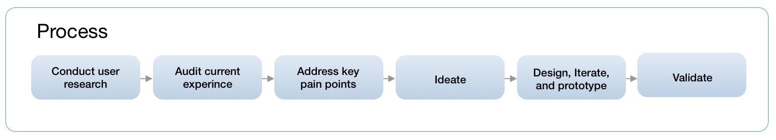
Audit the Current Product
After understanding customers' needs and concerns, I started to revisit and audit the existing experience. Auditing the existing experience helped me see the bigger picture of the product and also inspired me to come up with strategies to resolve the user concerns I discovered from the previous research.
One feature that I led the design was: upload document experience (across countries).
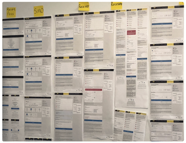
My approach is to first gather all the screens from the existing website and then categorize them into fundamental groups. From there, I was able to see the entire user journey and evaluate the experience holistically.
Problems and Pain Points
While I was revisiting the web experience, I started breaking down the information architecture into fundamental pieces, then started filtering out the unnecessary steps and redundant information that won't benefit the goal of creating a fast and easy money transfer experience.
For instance, the online verification portal that millions of Western Union retail customers use to upload documents and verify their identity is lacking clarity in terms of directions and requirements. On the other hand, the experience didn't provide a solution for customers to resume the progress if they were interrupted in the middle of the process. That significantly impacted the overall user experience and satisfaction of the service.
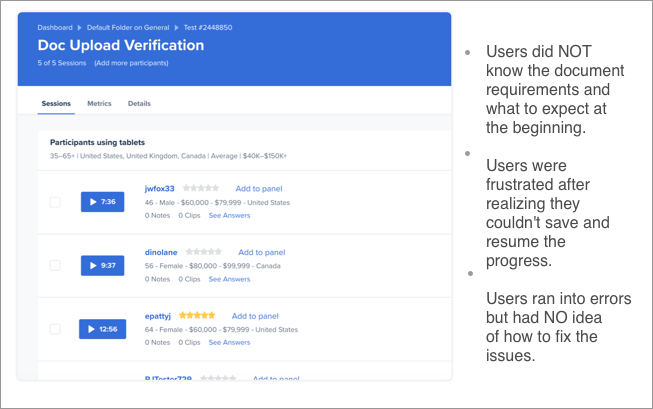
User Testing and Interviews
To make sure we are solving the real problem for the right audience, we often have to get contacted with the customers and learn insights directly from them.
Taking the online verification experience as an example. By doing user testing and interviews (via usertesting.com), I discovered several major issues that could potentially cause the drop-offs.

Brainstorming and Ideation
After fully understanding the problem(s) and learning what users think about the old experience, it's time to start brainstorming the possible solutions. To visualize the ideas, capture inspiration, and reflect the thinking process, whiteboard sketches and wireframing techniques are always being used in the process. Sketching out ideas on whiteboard helps us further understand the reasons why the existing experience was designed to be the way it is and how we can enhance the experience and make it better.

Design Goals and Objectives
Design goals often times are defined by the collaboration between project managers and designers after analyzing the problem(s) and synthesizing the research findings.
For instance, after knowing users' needs and concerns regarding the verification experience. I worked together with my project manager on the mission statement: help customers verify documents quickly and easily. Taking customers' feedback into consideration, we decided to:
1) Provide an overview of the verification process at the beginning to let users take control and set the expectation.
2) Add an option to allow users to save and resume progress.
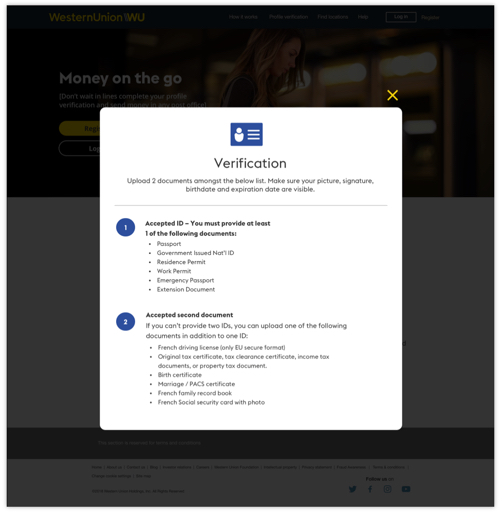
3) Specify the document requirements to ensure the document type and format are correct.
4) Offer clear instructions to let users know to expect after documents get verified.
5) Clearly convey the error messages and guide users to fix the issue.
Design Solutions
According to user testing results and feedback, people would like to know how to verify their documents first before initiating the process. To help set the expectation, we frontloaded the 'How it works' section to the verification home page to help customers learn the verification process and steps.
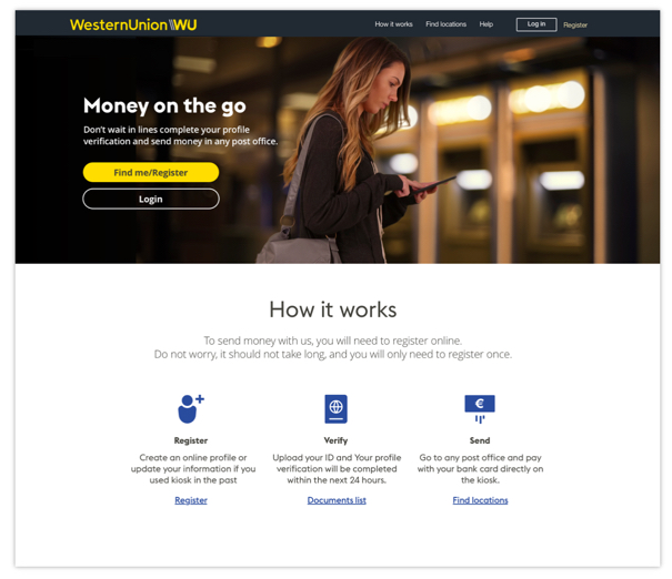
Document Requirements
A document list is also provided to customers to help them ensure the documents they upload are in the correct format. This helps avoid triggering system errors and ensures an easy and smooth user experience.
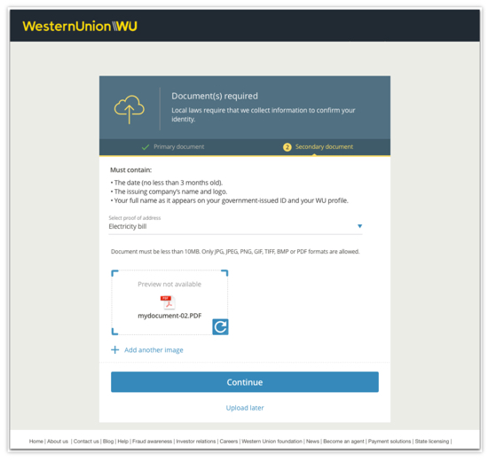
Option to Upload Later
Upload later option is provided to help customers save and resume the previous progress.
We also added the progress meter to the top of the screen to keep the transparency of the user's status.
Confirmation
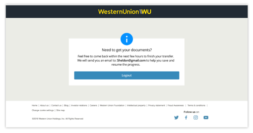
The new design also allows users to resume the progress by accessing the information via an email link the system sends to them automatically at the end of the experience to remind users to come back and complete the verification process. This helps ensure the conversion rate of the feature.
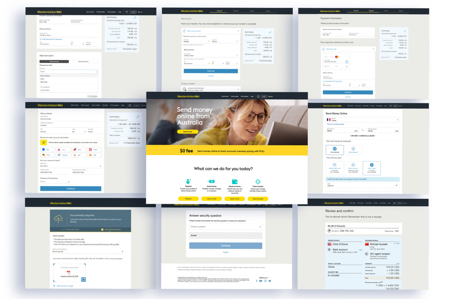
The New Verification Experience
Because verification is a mandatory step for customers to go through in order to successfully complete their money transfer, creating an easy and seamless experience helps customers fulfill transaction requirements fast and with ease. It also helps lift the conversion of the product and increase the revenue of the business.
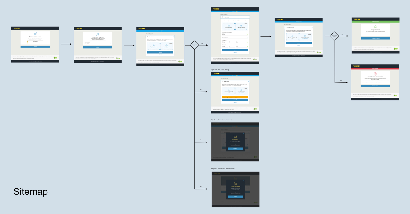
Below is the user flow diagram that shows the end-to-end experience of how to go through the verification process online.

Final Product
Working with cross-functional teams all over the world requires more than dealing with time zone differences, it relies on effective communication, trust between teams, dedication, and thorough documentation. As of today, Western Union's responsive websites have been used by customers from over 200 countries and territories, and the business continues to provide money transfer services to more and more people worldwide.
What I learned
I’m lucky enough to have the opportunity of working on a product that impacts how people spend money on such a large scale. When looking back, there are several key takeaways I would like to keep in mind moving forward.
During the production process, it is common to run into conflicts between users' needs and business goals, between product requirements and design principles, and between technical constraints and the desired outcomes. Design solutions do make compromises, but only for the purpose of aligning team vision and making sure the outcomes we bring to the customers are something that can help people solve their problems and make their lives slightly easier.
When working on a large-scale project, it's always important to keep scalability in mind. For instance, Western Union's responsive web products need to accommodate people from 200 countries and territories, which requires the content to be translated into more than 8 languages. Sometimes localization doubles the length of the content. Reducing the content is one obvious way to solve the issue, but it should not at the cost of losing the meaning of the messages. Scalability should be taken consideration in the first place to make sure the design solution applies and works across products and also to avoid running into unscalable issues later on in the process.